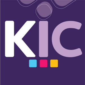
 As KIC continues to evolve as a growing force in the insurance and reinsurance markets, our recent rebranding reflects both the depth of our two decades of experience and our forward-thinking vision for the future. This transformation wasn’t just about refreshing our look—it symbolizes our commitment to innovation, growth, and excellence in serving our clients.
Our new brand identity is visually anchored by four key colours, each carrying symbolic meaning. The primary colour, purple, represents the strength and integrity that have been the foundation of our business for 20 years. In addition, we introduced three complementary colours to represent our main lines of business: blue for insurance, pink for reinsurance, and yellow for sureties. These colours reflect our strategic focus and expertise in each of these areas, bringing clarity and unity to our diverse operations.
Driven by a clear vision to align our brand with the dynamic global markets we serve, the rebranding reinforces our position as a trusted partner. While innovation and progress define our future, we remain grounded in the principles that have shaped our success—strong underwriting, prudent risk management, and tailored solutions. This rebranding marks an exciting new chapter as we build on our legacy while embracing the opportunities ahead.
Visit our website and social media pages to stay updated on our latest news, offerings, and products.


